
Colours To Help With Stress
Colour can help reduce stress and promote relaxation. The right colour palette can transform your home into a space to escape and destress.
Available at

Available at
The Colour Effect: Relaxing colours to help with stress
Stress is often an inevitable part of daily life, whether from your job, the news, or a busy personal life. Your home should be a place where you can get away from it all, switch off and unwind.
Colour can help you destress and create a relaxing atmosphere that promotes calm and tranquillity.
What causes stress?
Stress is your body’s reaction to mental and emotional pressure. If you’re feeling stressed, your body releases stress hormones like adrenaline and cortisol, causing that feeling of being out of control.
There are physical, mental and behavioural symptoms of stress. You might get headaches, stomach aches, struggle to concentrate or notice differences in your eating, drinking or sleeping habits. Understanding the signs of stress is an excellent first step in managing it.
How to manage stress
There are several different ways you can manage stress, including:
• Meditation or breathing exercises
• Physical exercise
• Breaking down big unmanageable tasks into smaller chunks
• Talking to someone, whether it’s a friend, family member or professional
You might find that some methods are more effective for you than others, but the important thing is to find the one that’s right for you.
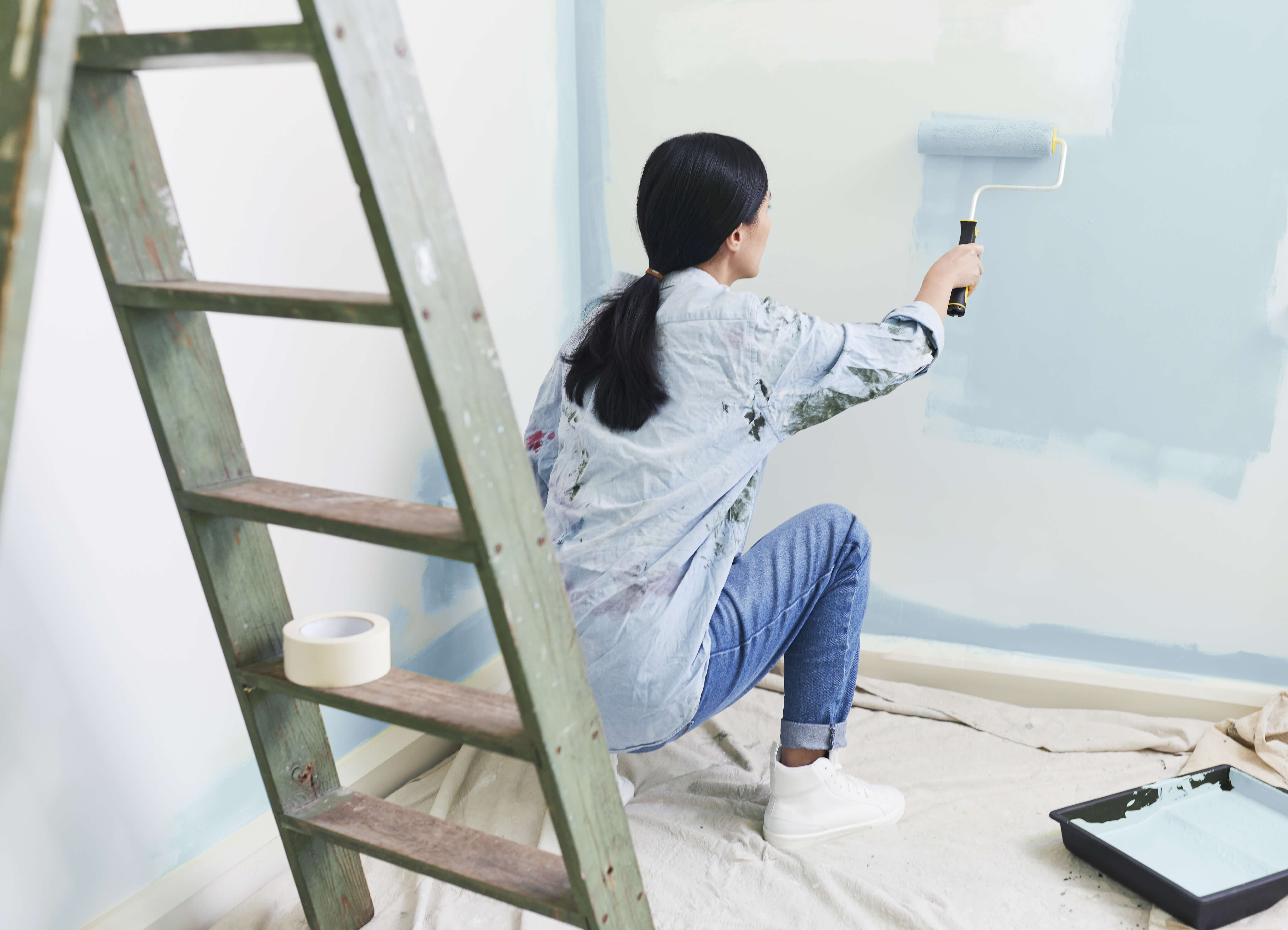
Another way to manage stress, which is often overlooked, is creating an environment you can immediately relax in. And colour plays a key role.
“
Softly faded and cool greyed colours, rooted in the natural world, create the perfect environment for us to practice mindfulness, taking a mental pause and quietly focusing on self-care" - Justine Fox, Applied Colour Psychologist, Calzada Fox
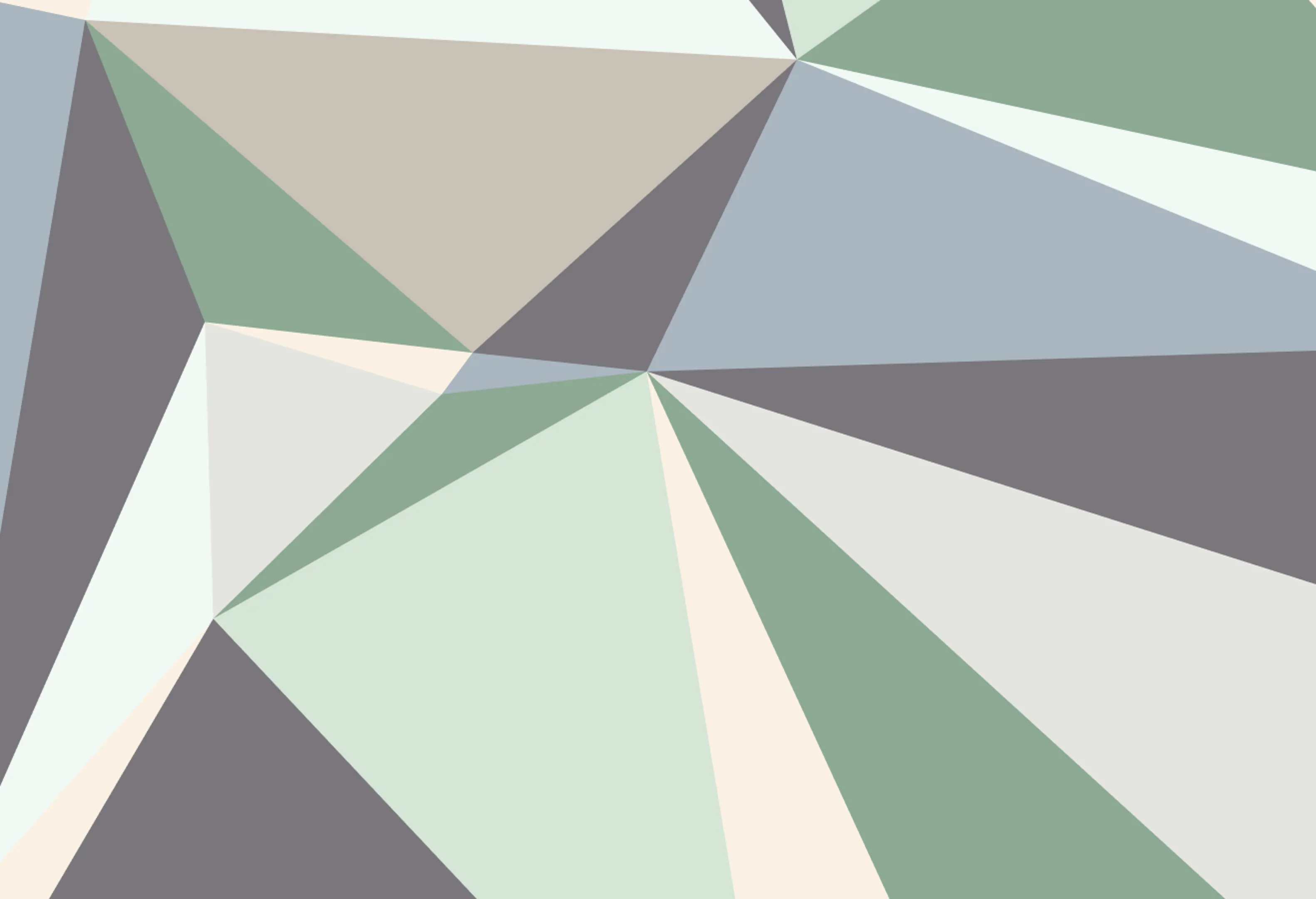
Relaxing colours to help with stress
For a space that helps you destress, it needs to be de-stimulating. This means simple colour schemes, visually smooth landscapes and no clutter.
The best schemes you can choose are tonal and uniform combinations. Tonal colours are the same colour but in different shades, such as navy blue and sky blue.
This uniformity is soothing, calming and easy for your brain to process. If you use these colours in combination with minimalist decor, you’ll have a very relaxing space.
Other colour scheme ideas come from the world around us. Research suggests that humans are ‘biophilic’, which means we’re connected to nature. So, in theory, colours inspired by nature are relaxing. This isn’t limited to blue and green; sandy and stone shades like taupe and oatmeal work too.
Grey also has calming properties. Grey tones are soothing because they bring paint colours closer to the colours we come across daily. We don’t often see vibrant shades when out and about, but we do see slightly muted colours. And grey helps achieve that. So choose colours that are a little hazy with grey undertones, mimicking the colours our brains are used to.
You can also choose colours that you’re familiar and most in tune with. Combine this familiarity with grey undertones and you’ll have a stress-soothing colour scheme.
To help inspire you, we’ve created a colour palette to aid in stress reduction.
How to use this palette
To help with stress, use as few colours as you can so there’s not too much visual clutter.
Avoid darker shades and instead choose lighter colours that can soothe. As well as this, use complementary shades to help give your brain a break.
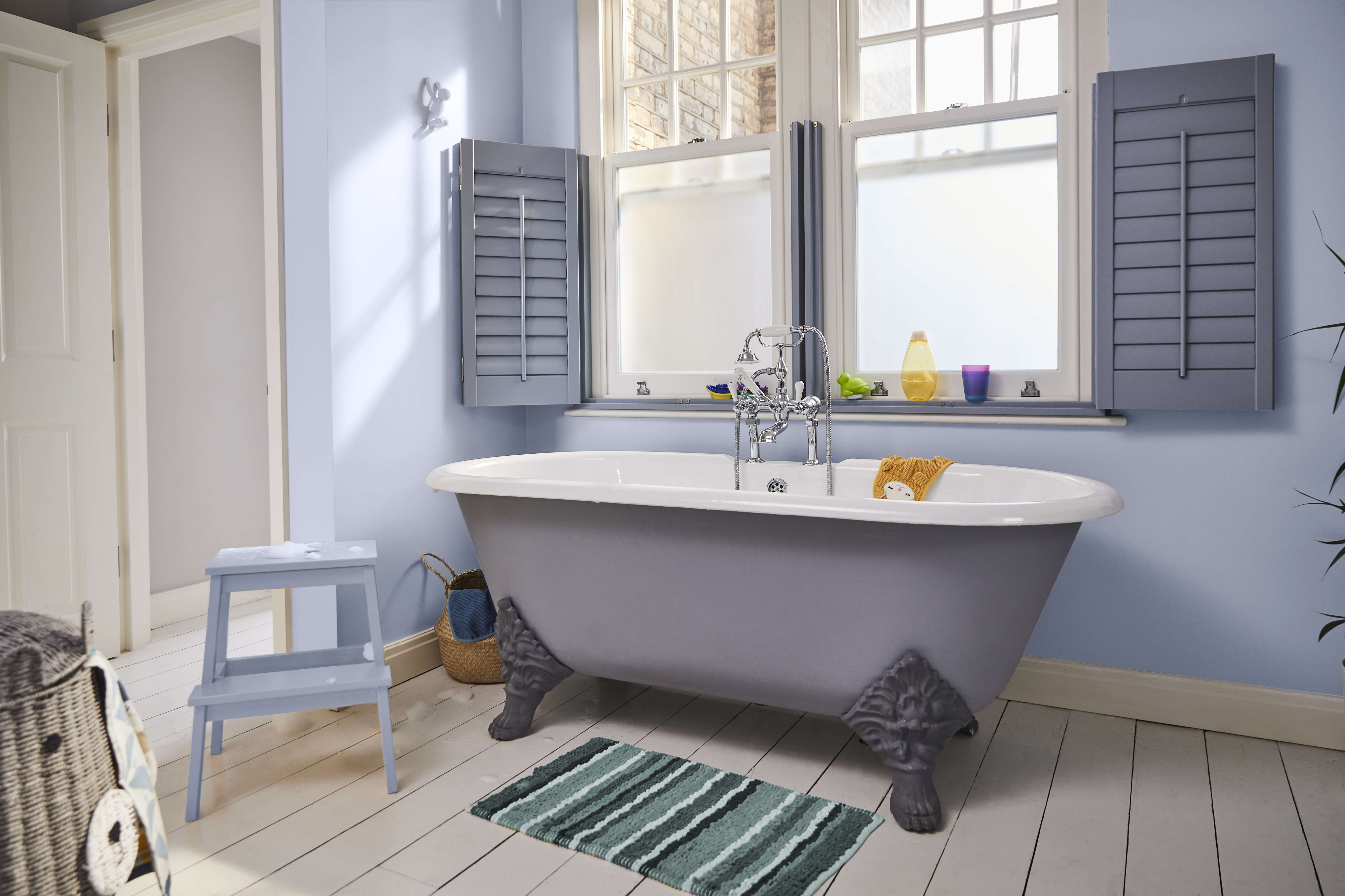
Painting your skirting boards and woodwork in the same tones as your walls gives your eyes a smoother experience. This helps to make the room seem bigger too and so lowers levels of anxiety.
The palette isn’t only for the colour on your walls. You can apply it to your furniture, soft furnishings and even accessories.
Find out more about relaxing colours and create your own palette
Download The Colour Effect vs Stress to read more tips from our colour experts and get advice on how to create your own relaxing colour palette.
About the experts
Justine Fox, Applied Colour Psychologist, Calzada Fox
Justine is a consultant with a unique understanding of applied colour psychology, colour trend, insights and colour ergonomics with future thinking. Her multi-disciplinary perspective on colour creates engagement with people through product development, social content, publications and immersive installations.
Calzada Fox’s multidisciplinary background covers architecture, citizen experience, branding and graphic design. Their driving philosophy is that the power of colour goes beyond aesthetics and should be explored for its ability not just to enhance, but to add value and impact to specific projects in specific locations. Sometimes colour is quiet and sometimes it is vibrant, but it is never about us, it is always about the place, the people and the story.
For professional advice on how to manage stress, visit the NHS website.

Seasonal Affective Disorder
Change the tone of winter with shades that reflect as much natural light as possible. Explore a taste of colour theory with our expert colour psychologists.
Learn More
Best colours for sleep
Colour is one way you can turn your bedroom into a tranquil setting, priming yourself for sleep. Hear from our experts and create a cosy cocoon of dark tones to relax your brain ready for bed.
Learn More