
Seasonal Affective Disorder
Find out how colour could help with Seasonal Affective Disorder and check out our specially designed colour palette below.
Available at


Available at
The Colour Effect: Seasonal Affective Disorder
For many of us, our homes are our sanctuaries. They’re the places we go to rest, play and recharge our batteries. In a nutshell, our homes are important in supporting our wellbeing.
We’ve enlisted the support of colour psychologists and experts to explain how you can use your surroundings to help with sleep, stress and Seasonal Affective Disorder.
What is Seasonal Affective Disorder?
Seasonal Affective Disorder, or SAD, is a reaction in your body to a lack of sunlight. It disrupts the hypothalamus part of our brains, which affects the production of melatonin and serotonin hormones. This means that feelings of happiness are biologically lessened.
Approximately 3 in 100 people have Seasonal Affective Disorder in the UK. Making the most of daylight, exercise and bright environments or working conditions can help you manage the symptoms.
Treatments for SAD include light therapy, lifestyle changes, medicine and talking therapy.
So how does colour help with this?
“
Clean, fresh colours are optically brightening and reflective, enhancing the feeling of light in a room." - Justine Fox, Applied Colour Psychologist, Calzada Fox
Colours for SAD
Because a lack of full-spectrum sunlight causes SAD, the colours you choose should reflect as much natural light as possible.
As a starting point, choose shades with white bases for the brightest appearance across the colour spectrum.
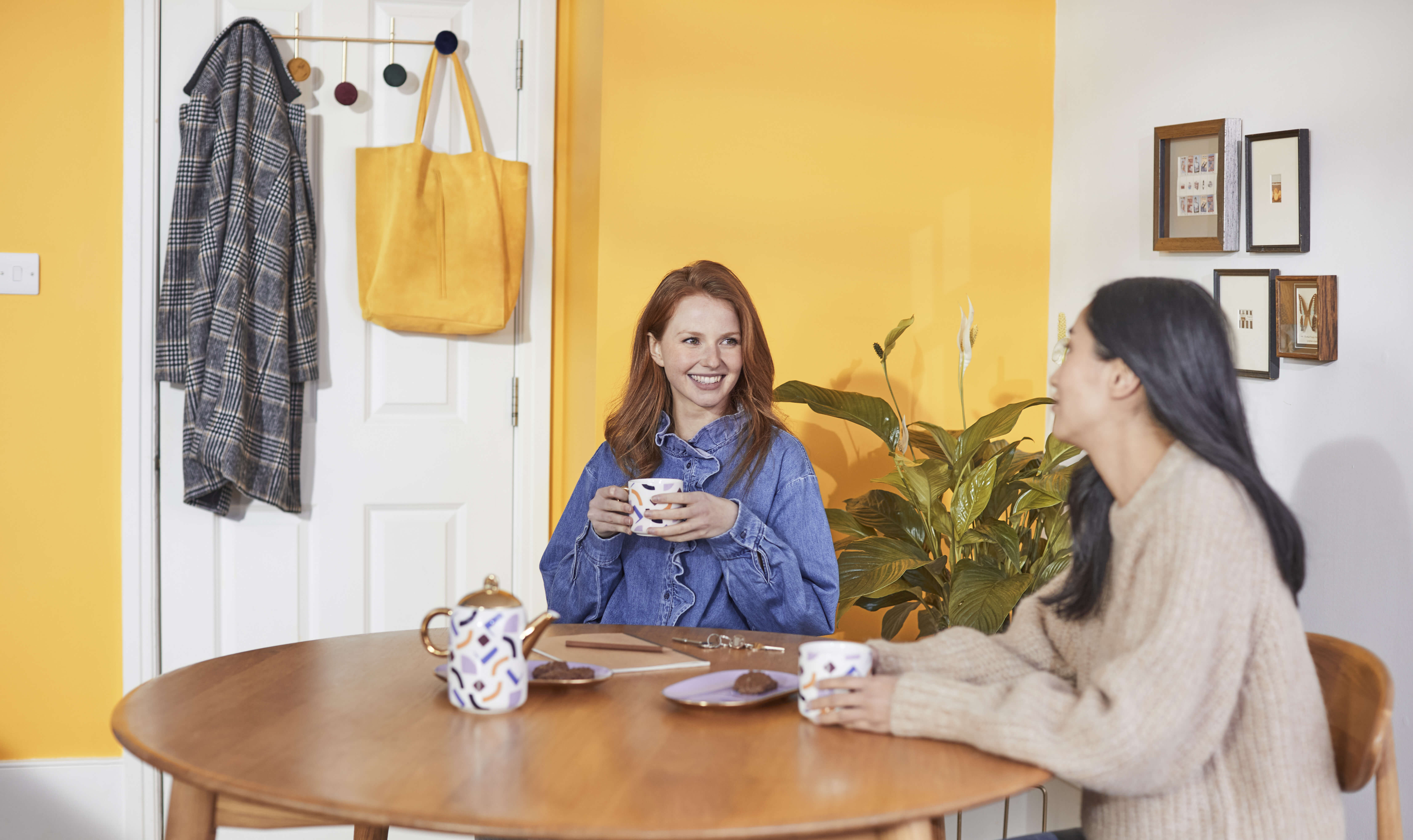
Orange and green tones are traditionally associated with positivity and joy and make a great foundation for your colour scheme.
But you don’t have to only use orange and green. Because of the cool nature of winter sunlight, choose a colour you like and then go one shade warmer. To make sure the colour is right, use our in-store LightBoxes to see how your chosen colour looks in different lighting.
Brighter and more saturated colours (think shades with more ‘colour’ in them) retain vibrancy in duller lighting, making them a great option year-round.
Colour is such a personal choice, and everyone has different shades that they associate with happiness.
Ultimately, choose a colour that makes you feel good about yourself and the space around you.
How to use this colour palette
This colour palette will work across any room and infuse it with positivity. Crisp off-white shades with hints of warm colour create a nice bright atmosphere and are perfect if you prefer neutrals.
You can also use this palette as colour accents throughout your room. Be creative and find fun ways to inject colour. Whether that’s painting a picture frame, highlighting period features or using it in your soft furnishings, have fun with colour.
Find out more about colour and SAD
Find out more from our colour experts and get more tips on creating your own colour palette to create an optimistic atmosphere.
About the experts
Justine Fox, Applied Colour Psychologist, Calzada Fox
Justine is a consultant with a unique understanding of applied colour psychology, colour trend, insights and colour ergonomics with future thinking. Her multi-disciplinary perspective on colour creates engagement with people through product development, social content, publications and immersive installations.
Calzada Fox’s multidisciplinary background covers architecture, citizen experience, branding and graphic design. Their driving philosophy is that the power of colour goes beyond aesthetics and should be explored for its ability not just to enhance, but to add value and impact to specific projects in specific locations. Sometimes colour is quiet and sometimes it is vibrant, but it is never about us, it is always about the place, the people and the story.
For more information about Seasonal Affective Disorder or to seek professional advice, visit the NHS website.

Best Colours For Sleep
Colour is one way you can turn your bedroom into a tranquil setting, priming yourself for sleep. Hear from our experts and create a cosy cocoon of dark tones to relax your brain ready for bed.
Learn More
Colours to help with stress
Stress is often a sign of over-stimulation and a busy brain. When used right, colour can help you unwind and decompress. Combat stress and soothe your mind with tonal and uniform colour combinations.
Learn More