Breaking down tonal paint pairings
Exclusively at

Life is too short and there’s far too many colour options available to choose just one for a room. If your customer is struggling to make a decision when it comes to paint colours, why not suggest tonal paint pairing? Read on, as we explain all!
What is tonal paint pairing?
Tonal pairing involves using different shades of a single colour to create a more cohesive look throughout an interior space. It can be a clever solution for highlighting room details, as well as creating a statement with colour.
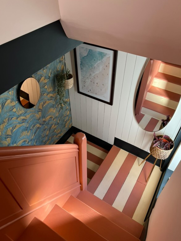
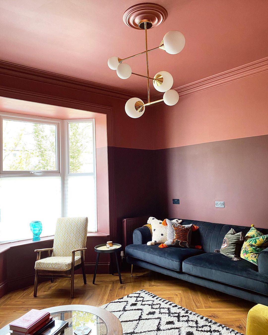
Consider contrasting woodwork, window frames, door frames or even radiators with a bolder colour pairing and selecting a lighter shade for walls. Alternatively, why not divide the wall area into lower and upper sections, or walls and ceiling, to create differentiation. Use darker or bolder shades on the lower half of the room and keep the top half lighter and brighter, giving the illusion of higher ceilings.
How do I choose the colours?
When selecting the colour pairing, we recommend choosing the main colour you are drawn to as a starting point. Then simply find a tone that is a few shades lighter than that colour, and another that is a few shades darker. This will help your customer determine which they prefer as the dominant shade, and which becomes the lighter tone and accent shade.
Some of our favourite colour pairings include Apricot Blush with Hearts Afire, Goose Feathers with Elk Antler, and London Lights with State Secret.
If your customer needs a little extra help, why not suggest that they visit their local B&Q store, where our Territory Sales Consultants (TSC) can guide them through our colour chip wall – carefully ordered in a way that mimics the industry standard colour wheel.
Does it only work for bold colours?
While other trends, such as colour drenching, may be a little intimidating for the more traditional homeowners, tonal paint pairings can be as bold or as subtle as you like!
It doesn’t have to be a bold statement. Even two neutrals a few shades apart can pair perfectly, helping to add interest and depth to a room. Or, why not select a neutral with just a hint of colour - such as White Moss, which has a green base, or Clotted Cream, a yellow base – and then add in a more saturated shade, like Rugged Olive to pair it with.
Is this trend just for walls?
Not at all. Secondary tones can come in the form of furniture, accessories and other surfaces. You could colour drench a paler tone, adding bolder or darker shades of the colour in furniture, soft furnishings or accessories.
To successfully deliver any colour trend, you need high-quality pigments, best-in-class tinting machinery and superior colour matching capabilities. With Valspar Trade, you get the perfect match and the perfect finish every time.
Learn more, here: https://www.valsparpaint.co.uk/valspar-trade/colour-story/.