
How to choose a colour scheme
Available to order online at

Choosing a colour scheme for your home can seem overwhelming – especially when you have millions of colours to choose from.
But to make the job a little bit easier, there are some colour theory rules which can help you narrow down your options and settle on a colour scheme that you love.
Definitions
Before we start, it might help if we first define a few key words.
Hue: A colour or shade e.g green, blue, yellow
Tone: The brightness or deepness of a hue. Adding grey effects the tone.
Shade: The lightness or darkness of a colour. Adding black changes the shade of a colour.
Tint: A variety of the same colour. Adding white changes the tint.
Things to consider when choosing your first colour
Before you can choose a colour scheme, you have to first pick your core colour. There are a few things for you to consider before you choose your base colour.
Lighting
Lighting can have a big impact on the way colour looks. As natural light changes throughout the day, so will the appearance of colour. Light can be so influential that one colour looks different from room to room.
The best way to check if you’re happy with the way a colour looks is to use tester pots and generously apply it to the wall or an old cut off piece of wallpaper. Keep looking at it throughout the day to see how natural – and synthetic – light changes it.
This kind of testing can also be useful to try colour schemes side by side.
Accessories and furniture
It’s much easier to buy a tin of paint than it is to buy a brand new sofa. So before you choose a scheme, buy all the furniture you love and then base your colour scheme around that. Don’t worry about choosing furniture that matches, if you follow your taste then a natural theme will emerge.
Accessories are a useful way to introduce a colour scheme to a room if you’re not quite ready to apply a scheme to a wall. Similarly, if you choose to use contrasting colours for instance, you could paint the wall one colour and then introduce the contrast through accessories. Basically, play around with configurations until you hit upon the one you love!
Don’t follow trends
While trends can be a good source of inspiration, they can also date quickly. This is definitely the case with trends that incorporate patterns or textures – unless you absolutely love a particular style or colour, don’t make a rash decision.
Find your inspiration
Inspiration can come from many different sources. Social media is an obvious place to start but be wary that a lot of social media posts are based around trends.
Soft furnishings and art can be a good source of inspiration and naturally show you which colour combinations go well together. They can also be a foundation colour and give you direction for your remaining colours.
Once you’ve chosen your core colour, you can then decide on the colour scheme.
Understanding different colour schemes
According to colour theory, there are four different types of colour schemes. Each require you to pick a starting colour and then, depending on the theory, you’ll be given colours that work well and complete the look.
You don’t have to use every colour in a scheme on your wall. You can choose one or two colours for your wall and use the others in your furniture and accessories.
1. Monochromatic
When you think of monochrome, what pops into your head? Black and white most likely which, in this instance, isn’t quite right. Monochromatic colour schemes take a core colour, like blue for example, and adds black or white to create a darker or lighter hue.
So blue, duck egg blue and inky blue is a monochromatic colour scheme.
Monochromatic colour schemes work well when interspersed with neutrals like white or grey. This prevents them from becoming too overwhelming and matchy-matchy.
It works well in smaller rooms as the constant similar colours give the impression of the room feeling ‘airy’.
A monochromatic colour scheme is also ideal if you want to express yourself through furniture and furnishings instead. You can freely choose patterns and textures without worrying about overpowering with too much colour.
Because a monochromatic colour scheme is all about unity, it works well as a theme to have throughout your home. Moving from room to room won’t feel jarring and it’s a good scheme to stick to if you’re decorating for the first time.
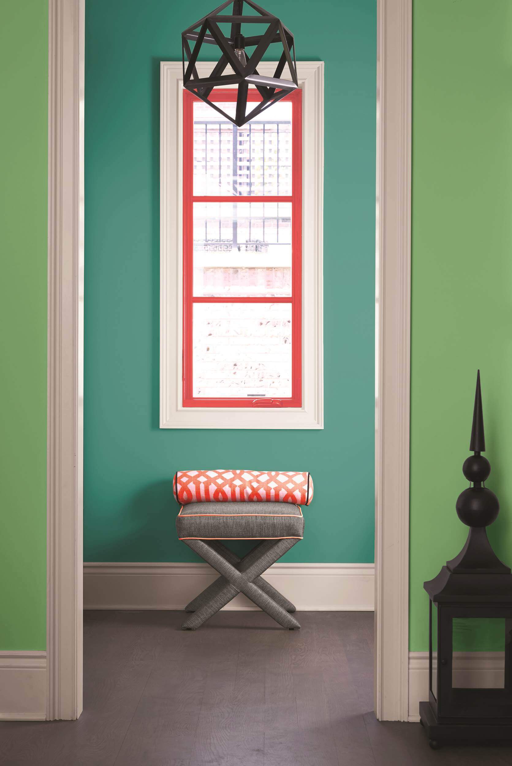
2. Analogous
Analogous colour schemes are more colourful than monochromatic and make use of different hues that sit next to each other on the colour wheel. For example red, red-violet and violet would form an analogous colour scheme.
This is a good option if you’re keen to make use of colour but are worried about getting it right. All you have to do is choose a core colour and then look either side for the colours that work well.
Analogous colour schemes create a calm atmosphere as the colours naturally work well together. It’s a great option in rooms you want to relax and unwind in like a bedroom.
They can work particularly well if you want to use bright colours to create a clash. Just make sure you introduce plenty of white to break up what could become overpowering.
Of course, you don’t just have to choose bright colours for this scheme to work. Darker hues are equally as effective at introducing colour and can help to create a sophisticated vibe.
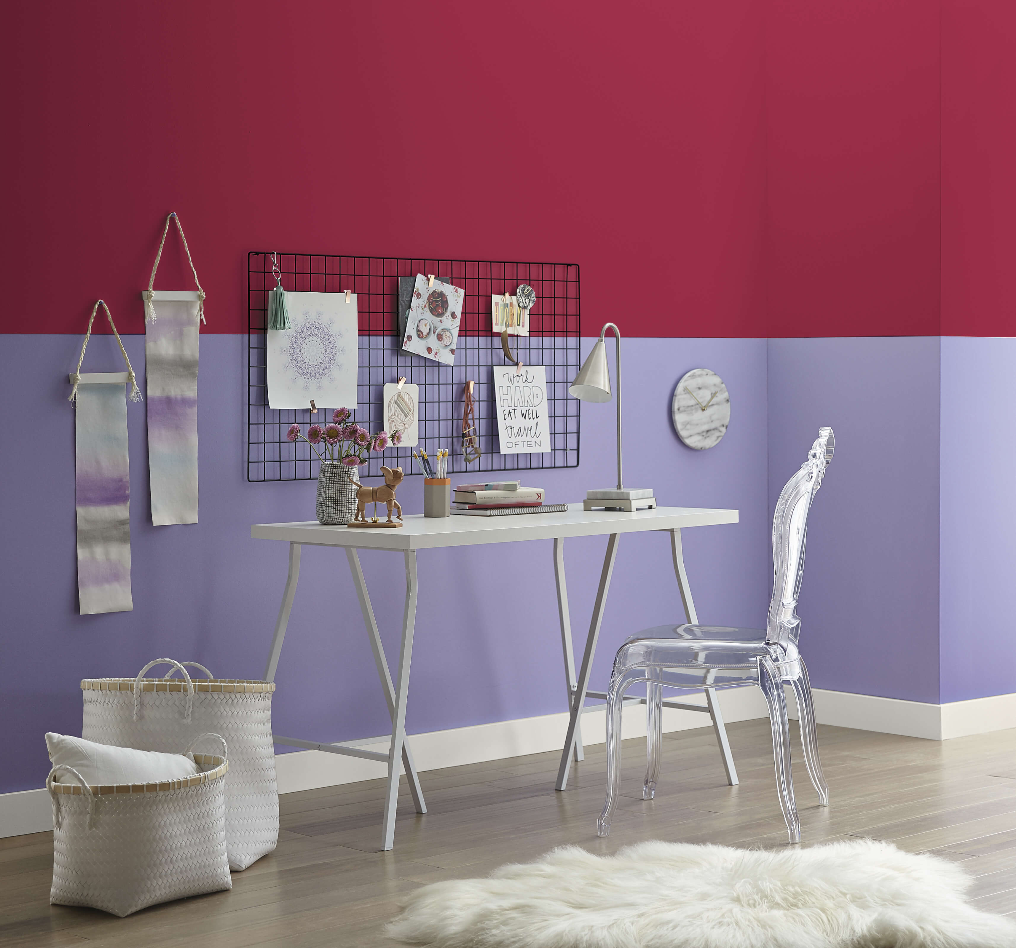
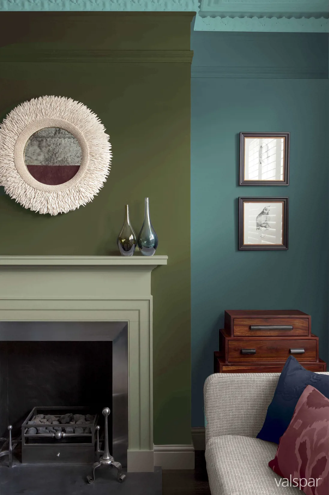
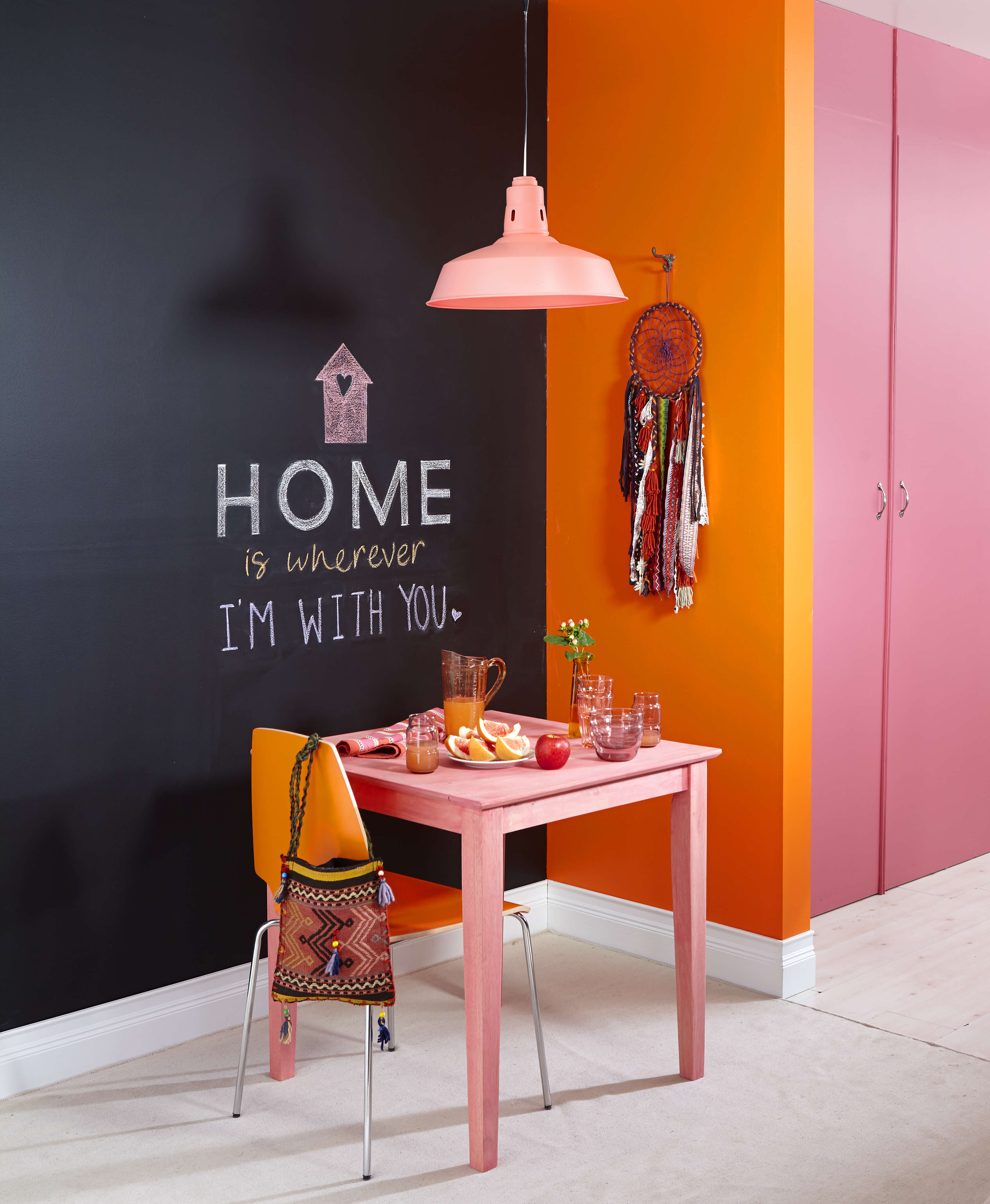
3. Contrast
Contrast colour schemes, sometimes known as a triad colour scheme, are three colours that are evenly spaced around a colour wheel. For example red-orange, blue-violet and yellow-green would form a contrast colour scheme.
This type of colour scheme is energetic, even if you use muted shades. It encourages creativity and challenges you to think differently when it comes to interior design.
If you want to dip your toes in a contrasting colour scheme, try experimenting with accessories and soft furnishings. These can provide the pop of colour you want, without overdoing the paint.
Pale shades can work well in a contrasting colour schemes. This helps you achieve the look you want, without the overpowering bold shades that could quickly become too much.
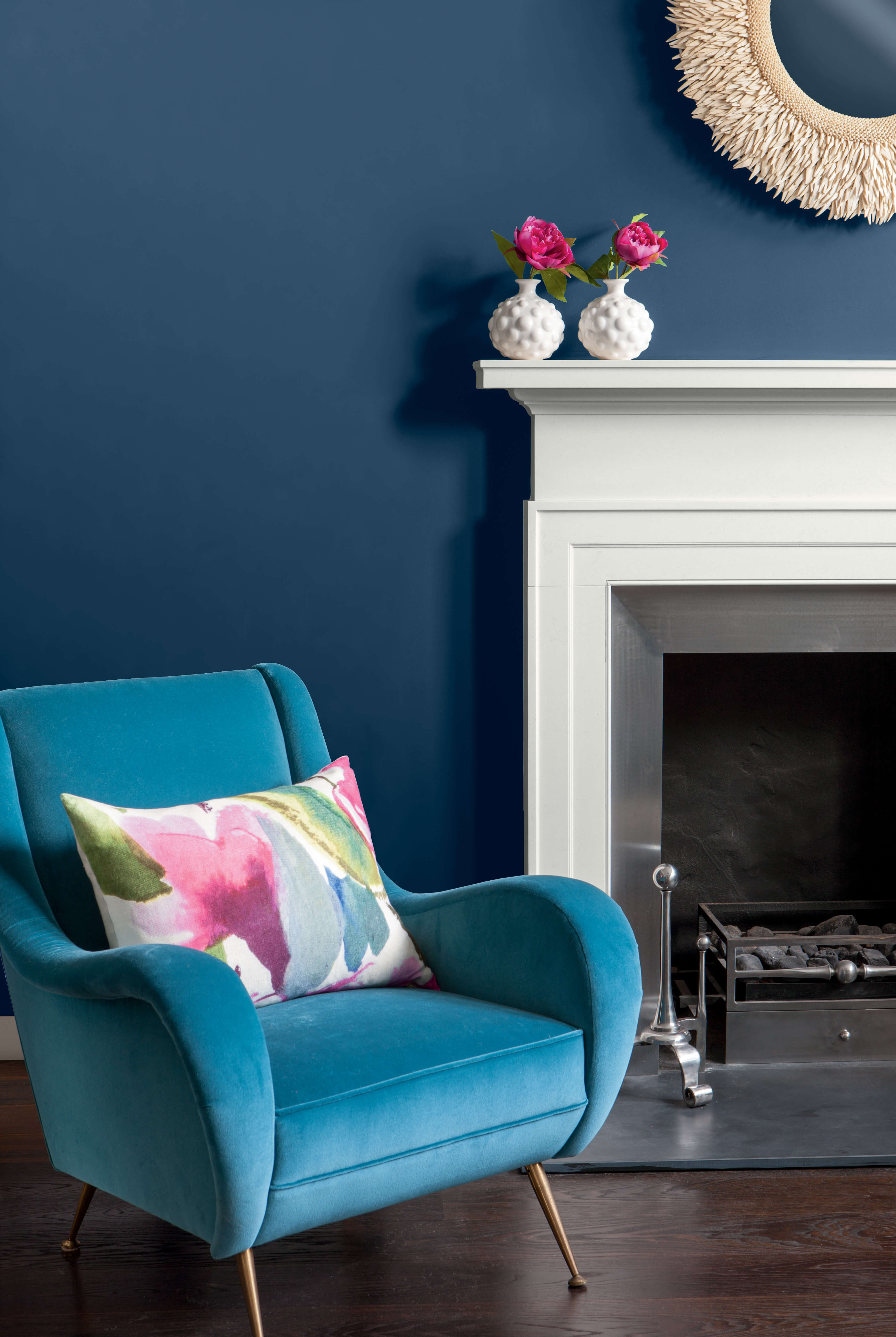
4. Complementary
Complementary colour schemes are made up of two opposing colours on the colour wheel. It’s dramatic but if used as a lighter tint or a darker shade, can still be impactful without being overwhelming.
It works well with cooler and warmer shades for example red interspersed in a blue room.
Because complementary colour schemes normally make use of two colours, it gives you the chance to embrace colour through your accessories and furniture.


SIGN UP TO OUR NEWSLETTER
Sign up to our Newsletter to get regular updates, inspirations and more!